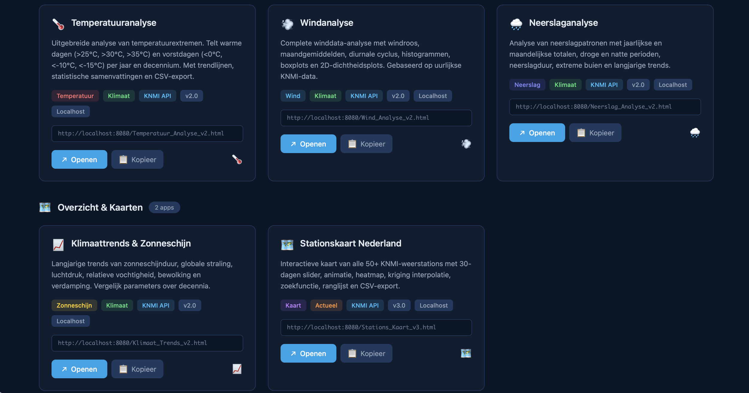
The Climate & Weather Suite
Temperature Analysis: Uncover Historical Climate Shifts
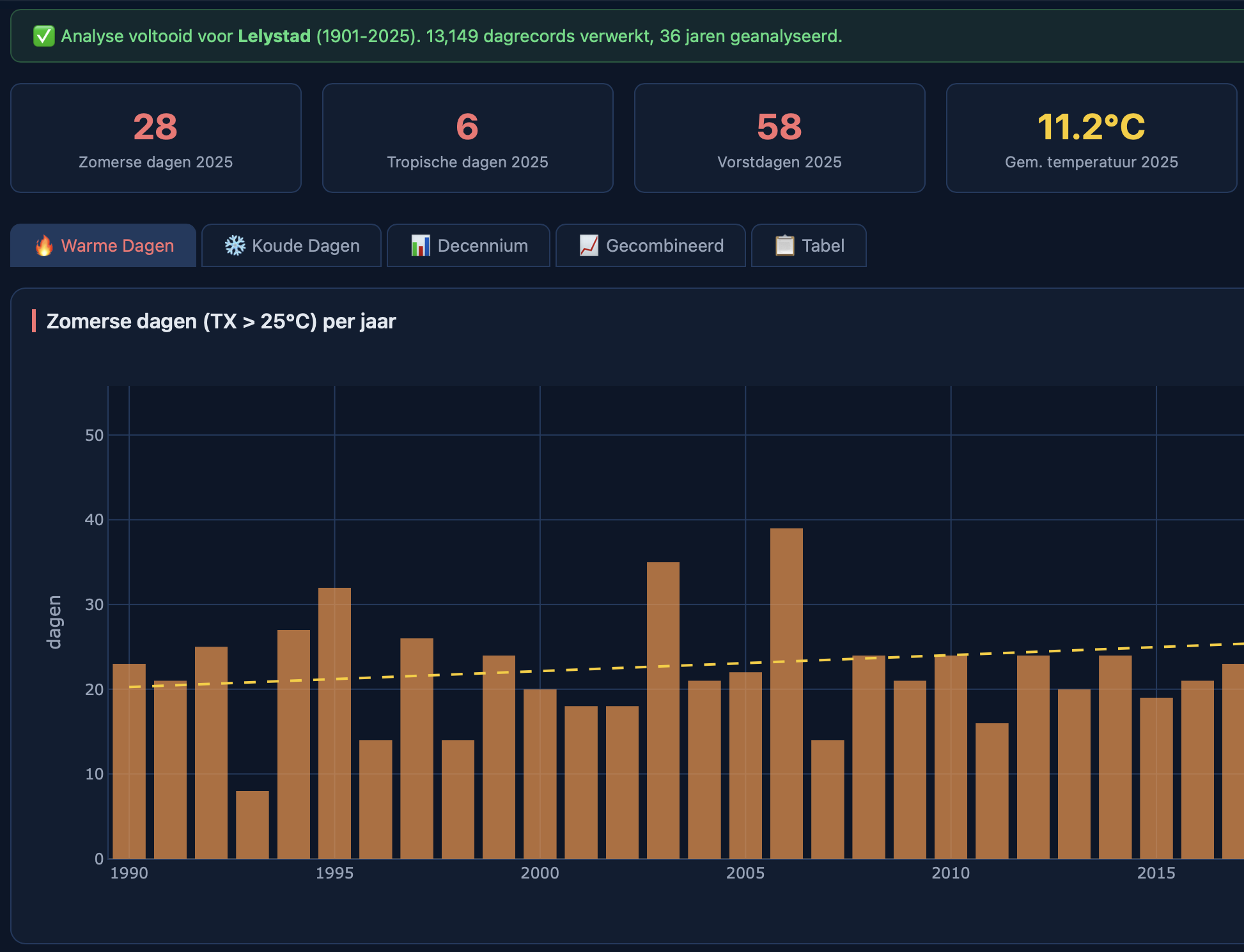
Go beyond daily forecasts and dive into over a century of climate data. The Temperature Analysis tool transforms raw daily measurements from the KNMI into powerful, long-term insights. Effortlessly track the frequency of heatwaves, tropical days, and frost periods, or visualize how average temperatures have evolved decade by decade.
With interactive trendline analysis and one-click CSV export, this application reveals the subtle but significant shifts in our climate. It is an indispensable resource for researchers, educators, and anyone seeking to understand the historical context of climate change. One HTML file, zero dependencies, powered by live API data — all from your browser.
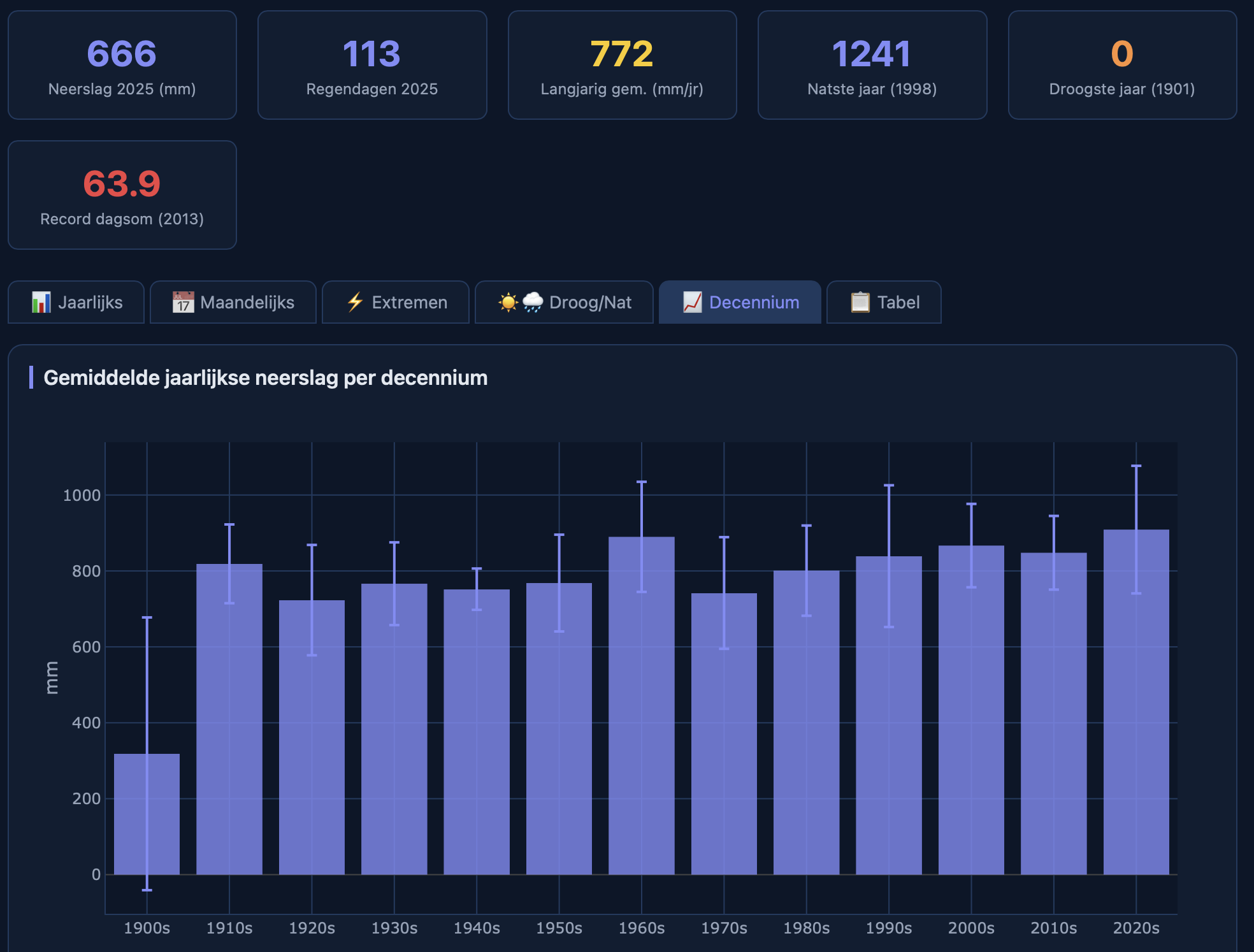
Precipitation Analysis — Charting the Flow of Water
From prolonged droughts to extreme downpours, precipitation patterns are becoming increasingly critical. The Precipitation Analysis tool offers a deep dive into Dutch rainfall history. Track annual and monthly precipitation totals, count the number of rain days, and identify the frequency of extreme precipitation events.
The application allows you to analyze trends in wet and dry periods over decades, providing crucial context for water management, agriculture, and infrastructure planning. With its intuitive interface and direct KNMI API integration, this tool makes complex hydrological analysis accessible to everyone, helping you anticipate and respond to future water challenges.
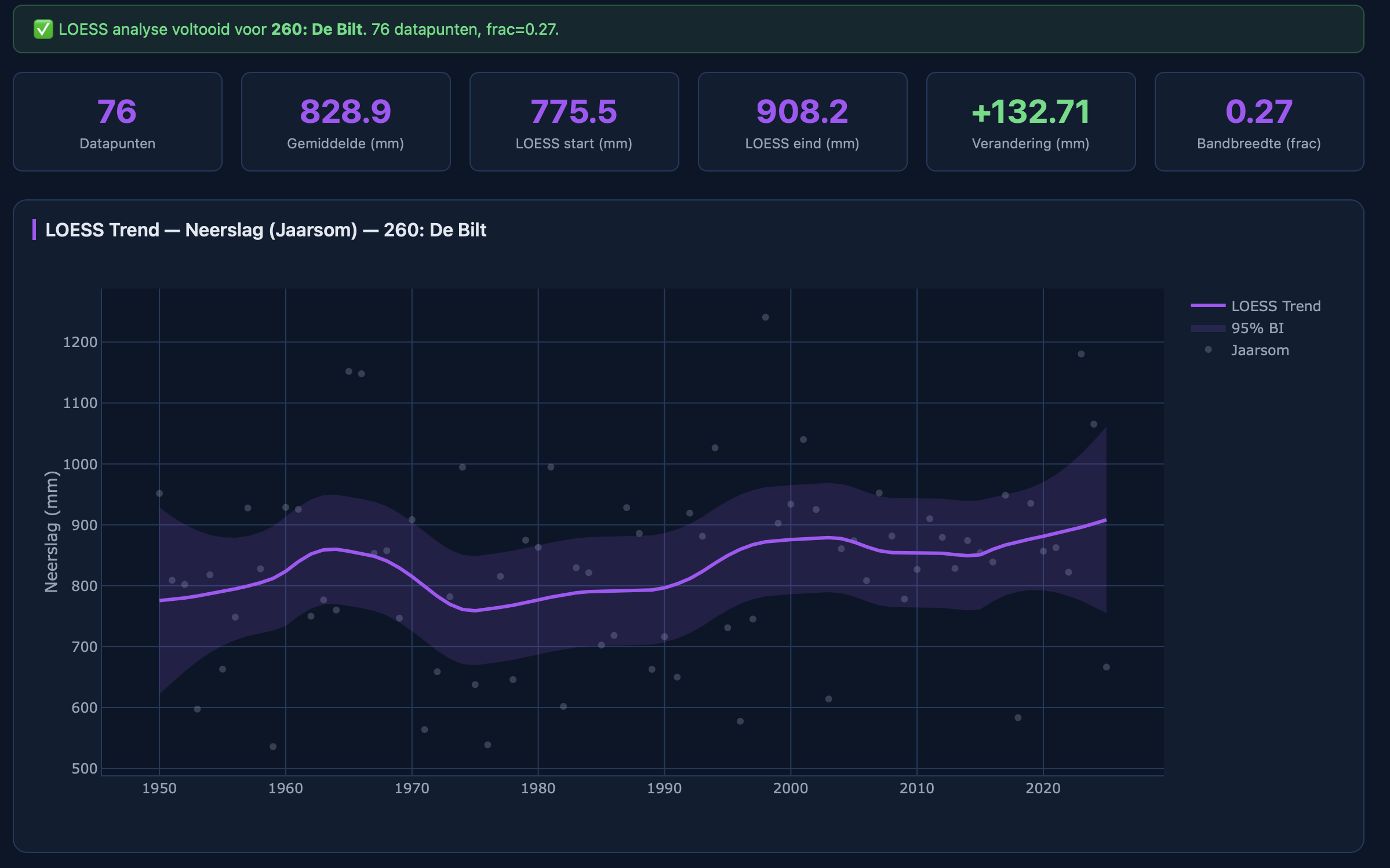
LOESS Trend Analysis: See the True Signal in the Noise
Climate data is inherently noisy. To uncover the true underlying trend, you need a sophisticated statistical approach. The LOESS Trend Analysis tool provides just that. This advanced application uses Locally Estimated Scatterplot Smoothing (LOESS) to fit a non-linear trendline to any selected climate parameter, complete with a 95% confidence interval.
It effectively filters out short-term fluctuations to reveal the long-term signal of climate change. Analyze the raw data, the smooth trend, and the residuals in three synchronized charts. It is a powerful instrument for statisticians and climate scientists who demand robust, defensible trend analysis.
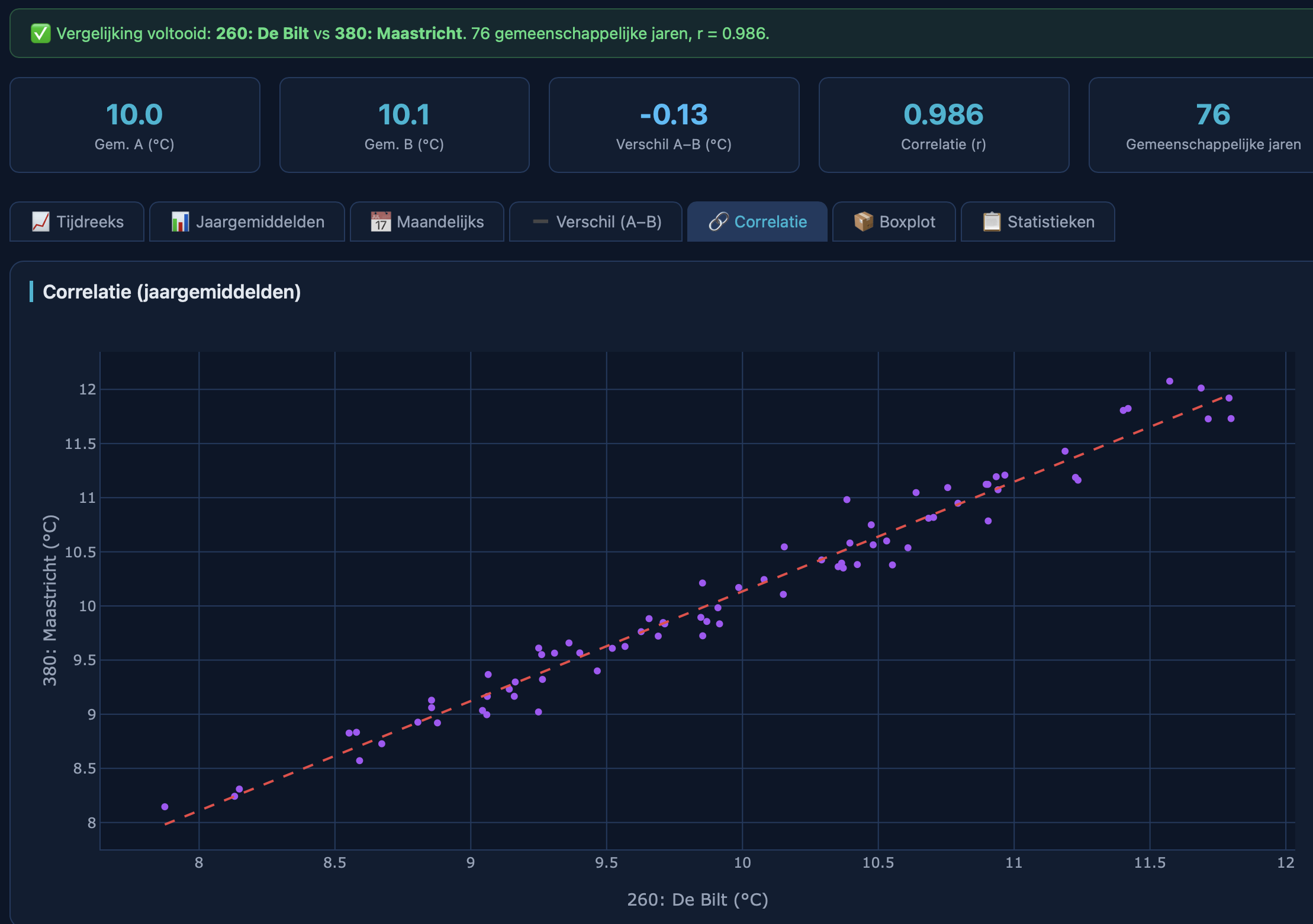
Station Comparison: A Tale of Two Climates
Geography matters. The Station Comparison tool allows you to perform a detailed side-by-side analysis of two KNMI weather stations. Dive deep into the differences and similarities with seven distinct analytical tabs: compare time series, annual averages, monthly patterns, and the direct difference between the two.
A powerful correlation scatter plot with a regression line quantifies the relationship between the stations, while comparative boxplots highlight distributional differences.
This is the ultimate tool for understanding regional climate variations, perfect for agricultural planning, event management, or any application where local climate nuances are critical.
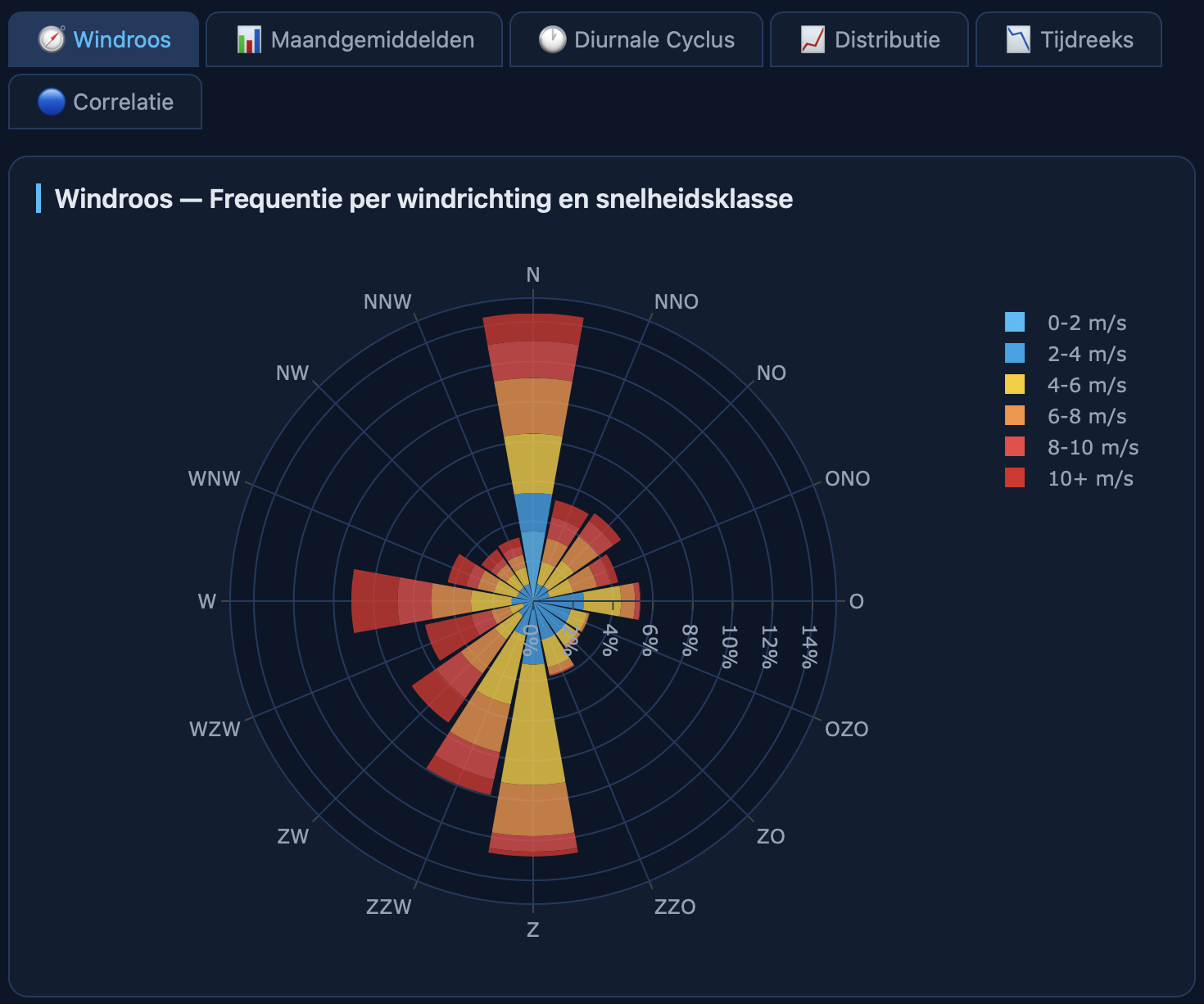
Wind Analysis — Visualize the Dynamics of Airflow
Wind is a defining feature of the Dutch climate, and this tool lets you explore its every nuance. The Wind Analysis application provides a comprehensive suite of visualizations, from the classic wind rose showing dominant directions to detailed monthly and diurnal cycle charts.
Analyze long-term trends in wind speed, identify seasonal patterns with boxplots, or explore the relationship between wind speed and direction using 2D density plots. Sourced directly from the KNMI hourly data API, this tool offers unparalleled depth for meteorologists, renewable energy analysts, and aviation professionals. U
nderstand the forces that shape our weather with scientific precision.
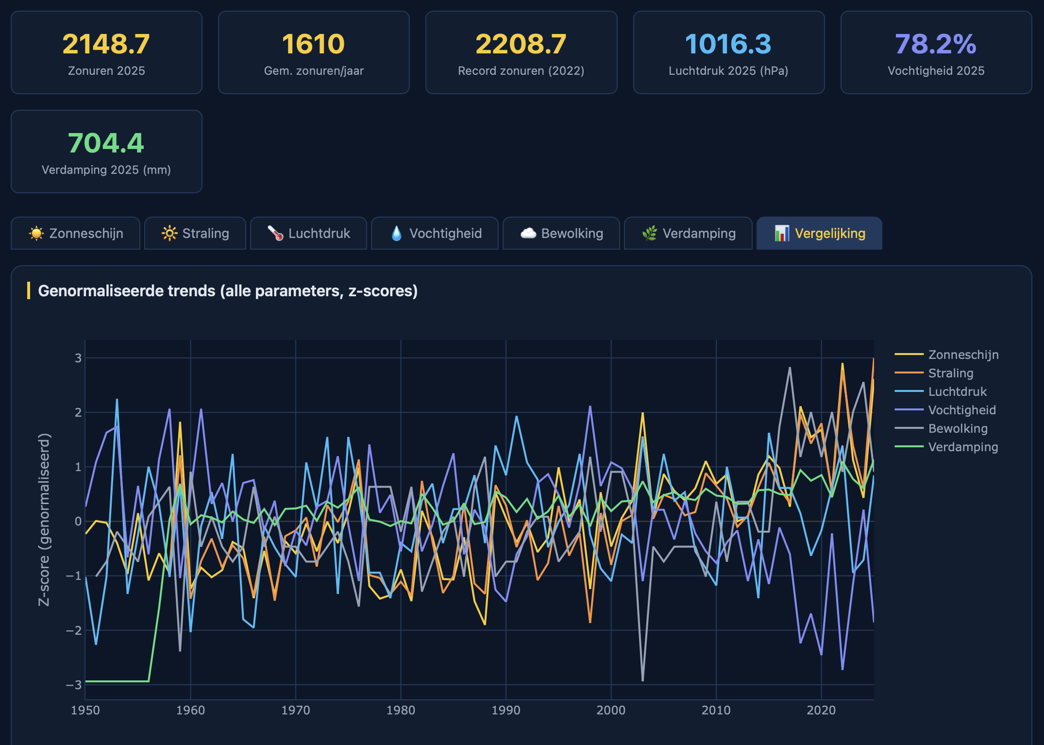
Climate Trends & Sunshine: Beyond Temperature
Climate change is a multi-faceted phenomenon. The Climate Trends & Sunshine application expands your analysis beyond temperature and precipitation, offering insights into a wider range of crucial climate variables. Track long-term changes in sunshine duration, solar radiation, atmospheric pressure, humidity, cloud cover, and evaporation.
The unique Z-score comparison chart allows you to see how different variables deviate from their long-term averages, revealing interconnected patterns and anomalies. This tool is essential for agricultural scientists, energy grid managers, and researchers looking for a holistic view of our changing climate, providing a complete picture of the forces at play.
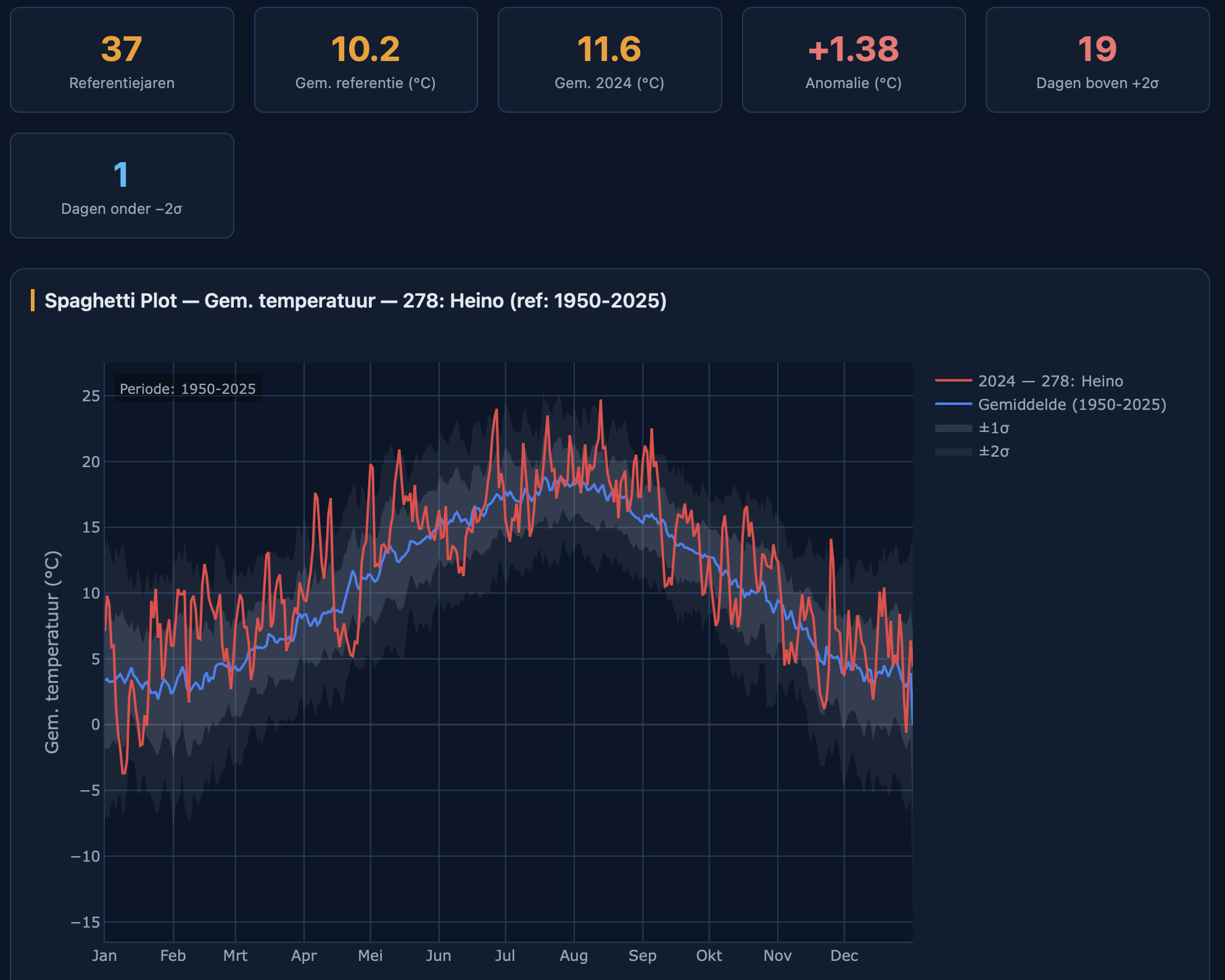
Spaghetti Plot: Contextualize the Present
Is this year’s weather truly unusual? The Spaghetti Plot application provides the answer. It visualizes the daily progression of a chosen climate parameter for a specific year, plotting it against the backdrop of the long-term climatological average (1991–2020).
The plot includes ±1 and ±2 standard deviation bands, instantly showing whether current conditions are within the normal range or are statistically significant outliers.
You can even overlay a second station for direct comparison. This tool is perfect for journalists, educators, and the public to contextualize daily weather events within the broader climate perspective, turning data into a compelling narrative.
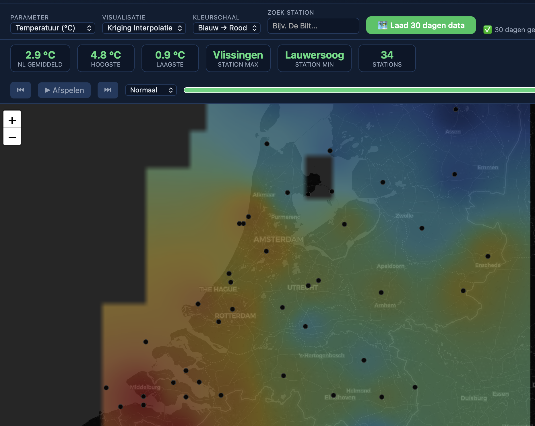
Interactive Station Map: The Netherlands at a Glance
This is your command center for real-time Dutch weather. The Interactive Station Map v3 is a complete overhaul, offering unparalleled situational awareness. A 30-day time slider with animation lets you watch weather patterns evolve across the country.
Switch seamlessly between three visualization modes: classic Markers, a stunning Heatmap, or a smooth Kriging interpolation for a complete surface overview.
With a powerful search function, sortable station rankings, multiple color scales, and one-click CSV export, this tool provides a comprehensive, dynamic, and visually rich overview of the nation’s weather. It is an essential tool for meteorologists, logistics planners, and public information officers.